7 Essential Metrics for Your Headcount Analytics Dashboard
Explore how a headcount analytics dashboard gives real-time visibility into workforce data, budget, and hiring, all in one place.

Are your Finance, HR, and Recruiting teams all looking at different headcount numbers, and none of them match? 56% of HR leaders say misaligned workforce data between HR and finance directly delays hiring decisions.
Clearly, this happens because there is a workflow hindrance. When headcount visibility breaks down, budget overruns happen, hiring stalls, and leadership loses confidence in the people data they rely on.
If you manage a headcount at a growing company, this blog covers exactly what a headcount analytics dashboard is, what it must surface, and how to build one without a dedicated analytics team.
At a Glance
- A headcount analytics dashboard connects your workforce data, open roles, and compensation budgets in one real-time view.
- It serves Finance, HR, and Recruiting simultaneously, not just one team.
- The 7 core metrics it must track go well beyond headcount count, including comp band coverage and forecast accuracy.
- Growing companies can build a functional dashboard without a dedicated people analytics team if they follow the right approach.
- CandorIQ unifies headcount planning, pay bands, compensation cycles, and offer workflows in a single platform, purpose-built for lean HR and Finance teams at growth-stage companies.
What is the Headcount Analytics Dashboard?
A headcount analytics dashboard is a real-time reporting interface that consolidates workforce data, current employees, open roles, pending hires, budget allocation, and compensation data into a single view that HR, Finance, and Recruiting can access simultaneously.
It tells you not just how many people you have, but how many you approved, how many you hired, what you spent, and where the plan went off track, before those gaps hit payroll.

How the Headcount Analytics Dashboard Differs from a Generic HR Dashboard
A generic HR dashboard looks backward. It shows last quarter's turnover rate, last month's engagement score, and last cycle's headcount. Useful for audits but not for decisions happening right now.
Here is the difference:
Once you see what a headcount analytics dashboard actually does versus what most HR dashboards offer, the next question becomes obvious: why does it matter enough to prioritize?
Benefits of the Headcount Analytics Dashboard?
.jpg)
Growing companies do not fail at headcount planning because their people are bad at their jobs. They fail because their data is siloed, their approvals live in email threads, and their reports are always one step behind the business. A headcount analytics dashboard fixes the infrastructure under those conversations.
- Finance and HR stop operating in separate realities: When both teams see the same approved roles, filled seats, and pending starts in real time, the weekly reconciliation meeting becomes optional, because there is nothing to reconcile.
- Budget overruns get caught before they hit payroll: Linking open reqs to approved budgets lets Finance see spend impact before an offer goes out. That is the difference between proactive governance and reactive damage control.
- Board reporting gets faster and more credible: CFOs and CPOs at growth-stage companies spend hours building headcount slides for board decks. A headcount analytics dashboard produces that data in one click, with a consistent format every cycle.
- Hiring decisions move faster: When Recruiting can see approved-but-unfilled roles alongside their ATS pipeline, they prioritize the right positions. No more discovering that a req was never approved after the candidate is in the final rounds.
- Compensation stays consistent across offers: Connecting headcount data to pay bands prevents offer-stage surprises, both for candidates and for Finance. Every planned hire has a compensation context before anyone picks up the phone.
- Leadership gains workforce confidence: When executives can see headcount-to-revenue ratios, department-level splits, and forecast accuracy on demand, they trust the data enough to act on it.
However, the metrics you track inside that dashboard determine whether these benefits actually materialize or stay theoretical. Let's get specific.
Also Read: Effective Applications of HR Analytics in Performance Optimization
The 7 Metrics a Headcount Analytics Dashboard Must Surface
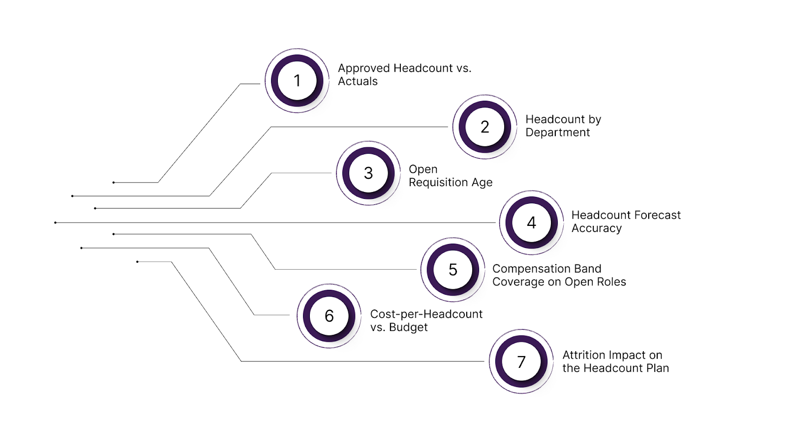
Most headcount dashboards report the same five metrics: total headcount, open roles, turnover rate, time-to-hire, and cost-per-hire. Those are fine starting points. But for a growth-stage company managing budget governance and cross-functional alignment, they are not enough. Here are the 7 metrics that actually move decisions.
1. Approved Headcount vs. Actuals
This is the most important budget governance metric on any headcount analytics dashboard. It answers a simple question: how many roles did leadership approve, and how many are actually filled, in-process, or still open?
The gap between approved and actual headcount is where budgets slip. A role approved in Q1 that stays unfilled through Q3 carries a phantom budget, money the company committed but has not spent.
2. Headcount by Department
Engineering, Go-To-Market (GTM), and G&A each department carries different cost profiles and strategic weights. Investors benchmark eng-to-GTM ratios. CFOs track G&A as a percentage of total headcount spend.
Without a department-level breakdown visible in the headcount analytics dashboard, board preparation becomes a manual exercise every quarter. This metric should be one click away, filterable by location and team.
3. Open Requisition Age
How long has your unfilled req been open? This metric is a signal that either reflects a broken sourcing process, a compensation band that does not compete in the market, or an approval that no one actually agreed on.
When req age is visible alongside the budget tied to that role, the headcount planning or forecasting decision becomes much more focused.
4. Headcount Forecast Accuracy
This is the metric almost no company tracks, and the one that most directly improves planning over time. Headcount forecast accuracy is a rolling view of how well your hiring plan predicted actual outcomes over the last 90 days.
If you planned to hire 12 heads in Q2 and hired 7, your forecast accuracy for that cohort is 58%. That number tells your finance team how much buffer to build into Q3 models, and tells HR where the planning process broke down. Companies that track this metric can consistently improve their forecast reliability within two quarters.
5. Compensation Band Coverage on Open Roles
Before a single interview is scheduled, your headcount analytics dashboard should show whether the approved budget for an open role falls inside your current pay bands. This prevents two scenarios that cost companies significant time and money.
Such as candidates who reach the offer stage only to find the budget cannot meet the market rate, and internal pay equity issues, which are created when a new hire's comp lands outside the band for their level.
Tools like CandorIQ help teams connect open roles with approved pay bands so these issues surface before the hiring process begins.
6. Cost-per-Headcount vs. Budget
This is different from cost-per-hire, which is a recruiting metric. Cost-per-headcount is a finance metric: the total loaded compensation, base, bonus, equity, and benefits, for each approved role, versus what the plan budgeted.
When a role's loaded cost exceeds its budget allocation, Finance needs to know before the offer goes out. This metric connects your headcount analytics dashboard directly to your P&L.
7. Attrition Impact on the Headcount Plan
When someone leaves, most headcount dashboards update the filled-seat count and stop there. The more useful question is whether that departure opens a backfill budget line in the plan, and whether it is now active or sitting dormant.
Tracking attrition-driven headcount changes in real time prevents phantom budget situations. Tools like CandorIQ help maintain this visibility by aligning attrition data, open roles, and headcount budgets in one place.
Now that you know what to measure, the next step is to determine which of those metrics to watch continuously versus review periodically. That is where KPIs come in.
Also Read: The 7 Best Headcount Planning Strategies to Scale Smarter
Core Headcount KPIs for Real-Time Monitoring in Analytics Dashboard
Metrics show activity. KPIs show performance against plan. For a growth-stage company, these headcount KPIs should update live in a shared dashboard, not wait for month-end reporting.
- Headcount Utilization Rate: Approved roles divided by filled roles. If 100 roles are approved and 78 are filled, utilization is 78%. Sustained levels below 85% typically signal a disconnect between hiring plans and execution capacity.
- Time-to-Fill by Department: Measured from req approval to employee start date, not application to offer. This exposes where delays occur and whether hiring slowdowns are isolated to specific functions or systemic across the company.
- Budget Burn Rate on Open Roles: Tracks how allocated budget moves against open positions. Roles that remain unfilled too long can distort runway projections and create misleading surplus assumptions in Finance models.
- Internal Transfer Rate: The percentage of roles filled internally versus externally. A rising rate may indicate strong internal mobility or external hiring friction. Without this distinction, total headcount growth can appear healthier than it actually is.
- Offer Acceptance Rate by Department: When monitored alongside band position, this KPI reveals compensation friction. If offers clustered at the lower end of the range consistently decline, the issue is likely pricing, not recruiting performance.
- Headcount-to-Revenue Ratio: Revenue per employee remains one of the clearest efficiency indicators for boards and operators. Tracking it automatically as headcount shifts ensures workforce growth stays aligned with revenue trajectory.
However, the real advantage comes from surfacing these KPIs in one live system, without relying on manual exports or a dedicated analytics team to keep them current.
How You Can Build a Headcount Analytics Dashboard Without a Dedicated Analytics Team
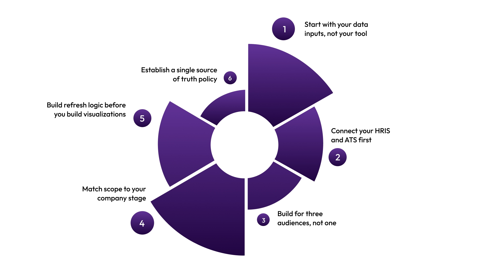
If you are a growing team, then you would not have a data engineer or a BI tool license to build your dashboard. Here’s how to build a practical headcount dashboard with the resources you actually have:
- Start with your data inputs, not your tool: Before you open any dashboard software, identify where your four core data sources live: HRIS (employee records), ATS (open roles and pipeline), hiring plan (approved headcount and budget), and comp data (pay bands and offer history). If any of this sits in isolated spreadsheets, fix that before designing dashboards.
- Connect your HRIS and ATS first: The most common failure mode is building a beautiful dashboard that requires someone to manually update it twice a week to stay current. Choose a platform or integration layer that pulls directly from your HRIS and ATS in real time. Manual feeds guarantee data drift, which guarantees distrust, which guarantees abandonment.
- Build for three audiences, not one: Your headcount analytics dashboard needs to serve Finance (budget vs. actuals), HR (workforce composition and comp equity), and Recruiting (pipeline and req status). Design role-based views from the start. When Finance logs in, they see cost and forecast data. When Recruiting logs in, they see the pipeline and open req age. When HR logs in, they see attrition, transfers, and comp band coverage.
- Match scope to your company stage: Don’t overbuild. Start with three metrics that directly connect to your biggest current pain: approved vs. actuals, req age, and forecast accuracy. Add metrics as your hiring volume and team capacity grow. Complexity that outruns adoption is the number one reason dashboards get built and then ignored.
- Build refresh logic before you build visualizations: Outdated data destroys credibility. Establish an automated data refresh before you spend time on design. Daily automated sync is the minimum. Hourly sync is better for companies hiring at volume.
- Establish a single source of truth policy: The headcount analytics dashboard only works if every team agrees to stop maintaining parallel spreadsheets. So, get finance, HR, and recruiting leadership aligned on this before launch, or the dashboard becomes one more competing source rather than the authoritative one.
Also Read: Best HR KPI Dashboards and Examples
If you’re still stitching tools together and maintaining exports manually, the issue isn’t execution. It’s your stack. That brings us to where CandorIQ fits.
Stop Managing Headcount Across Disconnected Tools
Most growth-stage HR and Finance teams run headcount planning in spreadsheets, manage comp in separate tools, and handle offers over email. When one piece changes, the others don’t, leaving dashboards that look complete but tell conflicting stories across Finance, HR, and Recruiting.
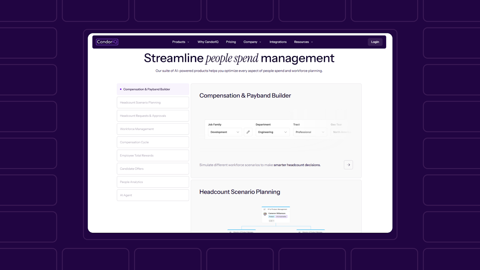
CandorIQ unifies headcount planning, compensation bands, hiring plans, and offer workflows in one system built for scaling Series B–D teams, so everything stays aligned and updates in real time.
Here is what CandorIQ gives your team:
- Workforce Management Dashboard: Track open roles, filled seats, attrition, and promotion rates in one live view. Align actuals vs. plan on headcount and compensation. Build custom views for the executive, finance, and HRBP teams.
- Headcount Scenario Planning: Model future org charts and view their financial impact before committing. Toggle multiple hiring scenarios and compare against budget thresholds in real time. Finance and People Ops collaborate on the same model, not competing spreadsheets.
- Compensation and Pay Band Builder: Define pay bands by level, location, and department. Apply geo-adjusted benchmarks. Visualize pay distribution across your workforce and maintain version control for auditability.
- Headcount Requests and Approvals: Create new hire requests with embedded job details, rationale, and budget. Route approvals dynamically based on team, location, or compensation thresholds. Sync approvals directly with your ATS and Finance systems.
- Compensation Cycle Automation: Automate merit and bonus reviews with built-in approval logic. Track budgets and raises by department in real time. Send reminders and approvals through email or Slack.
- Candidate Offer Management: Give candidates visibility into total comp, salary, equity, bonus, and benefits, with future-value equity modeling. Reduce repetitive HR questions with interactive offer documents.
- AI Agent: Ask natural language questions to analyze compensation gaps, forecast headcount needs, or model budget impact. Receive recommendations based on historical benchmarks and peer data without pulling a single manual report.
CandorIQ gives Finance, HR, and Recruiting the same data, in the same place, at the same time, so your headcount analytics dashboard reflects one version of the truth.
Conclusion
A headcount analytics dashboard is only as useful as the data feeding it and the teams trusting it. The companies that get this right are the ones that stopped treating headcount, compensation, and hiring as three separate workflows.
If your Finance and HR teams are still reconciling headcount numbers every Monday morning, the dashboard is not the problem. The disconnected systems underneath it are. Fix the infrastructure first. The visibility follows.
Ready to see what unified headcount planning looks like for your team? Book a demo with CandorIQ.

FAQs
How often should a headcount analytics dashboard be updated?
Daily automated sync is the minimum for growing companies. Teams hiring at volume benefit from hourly updates. Manual or weekly refresh creates data drift and reduces stakeholder trust in the dashboard over time.
Can a small HR team manage a headcount analytics dashboard without a data analyst?
Yes — if the platform integrates directly with your HRIS and ATS. The key is eliminating manual data entry. Tools like CandorIQ are purpose-built for lean teams and do not require dedicated analytics resources to maintain.
What systems should a headcount analytics dashboard integrate with?
At minimum: your HRIS, ATS, and approved hiring plan. For full budget governance, it should also connect to your compensation data and FP&A model so cost impact is visible alongside role status.
How does a headcount analytics dashboard support pay equity?
By connecting open roles and new hires to pay band data before offers are made. When comp band coverage is visible in the dashboard, HR and Finance can catch equity risks at the planning stage rather than after the hire.
Is a headcount analytics dashboard the same as a workforce planning tool?
Not exactly. Workforce planning is forward-looking scenario modeling. A headcount analytics dashboard tracks the current state, actuals vs. plan, and the real-time pipeline. The two are complementary, best used together within a unified platform.
Ready to modernize your workforce and compensation strategy?
See how CandorIQ brings workforce planning and compensation together with AI.